This is a master post containing links to the 5 different steps of the Progress of book making, and the photos to document the final book. It is the submitted "short history of the project, your general thoughts about it's "whys and wherefores", and a characteristic selection of images of the inside and outside of the book." Enjoy!
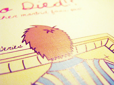
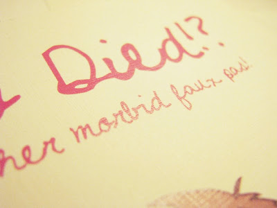
Sharing Book Photography of Who Died!?... and Other Morbid Faux Pas!
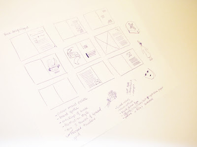
Step 1: Researching Content/Inspiration, Writing Manuscript, Determining Dimensions
Step 2: Setting an Illustration Style, Storyboard and Layout Sketches
Step 3: Method of coloring illustrations, Executing illustrations
Step 4: Choosing Paper and Binding Method
Step 5: Production
Sunday, December 13, 2009
Who Died!?... and Other Morbid Faux Pas!
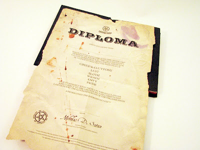
Please click the images for a larger version!
Book front:


End paper:

Half Title:

Full title:


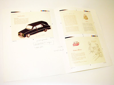
Table of Contents

Section title

Spreads:


End of the book:


Step 4: Choosing Paper and Binding Method
After completing the cover and some mockup illustrations and layouts, choosing paper and a binding method (which was originally decided but changed as it did not feel appropriate) was the next step. Things such as texture, colour, warmth, and weight were looked at.
Possibilities in paper choice:
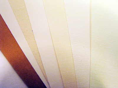
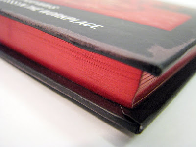
The final type of text block paper chosen was a slightly beige linen. It was picked because of the detailing that was not overly dominant, however gave the flat illustration coloring an added flavour. Initially, there was a concern over whether the texture was suited to the overall feel of the book, but in comparison to other papers, it felt appropriate.
Searching for the appropriate linen weight was a challenge as linen has a tendency to be comparatively more translucent at light weights (doublesided printing would show through), whereas another type of stock would not be as translucent. A compromise was made with a slightly heavier weight. There was also a difficulty in finding a matching cover paper, that was also linen, yet a heavier stock with the same colour. In the end, the paper used in the interior was doubled up to create the heavier cover.
A linen paper was chosen, note the detail in this image of a test print:
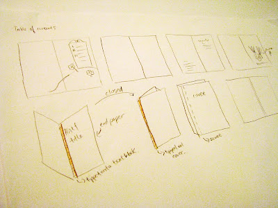
Several binding opportunities were explored as options. Intitally, the book was to be sewed in signatures (so it can lay open and flat) and cased in a hardcover, however, as the book progressed and developed its own tone of voice, a softer cover seemed more playful and thus, appropriate.
Also, perfect binding was chosen because the book is petite (4.5"x6.5") and did not need to lie flat (there was only one spread that had an image span across the full spread).
Sketching out self-binding methods and how to case in:
Possibilities in paper choice:

The final type of text block paper chosen was a slightly beige linen. It was picked because of the detailing that was not overly dominant, however gave the flat illustration coloring an added flavour. Initially, there was a concern over whether the texture was suited to the overall feel of the book, but in comparison to other papers, it felt appropriate.
Searching for the appropriate linen weight was a challenge as linen has a tendency to be comparatively more translucent at light weights (doublesided printing would show through), whereas another type of stock would not be as translucent. A compromise was made with a slightly heavier weight. There was also a difficulty in finding a matching cover paper, that was also linen, yet a heavier stock with the same colour. In the end, the paper used in the interior was doubled up to create the heavier cover.
A linen paper was chosen, note the detail in this image of a test print:


Several binding opportunities were explored as options. Intitally, the book was to be sewed in signatures (so it can lay open and flat) and cased in a hardcover, however, as the book progressed and developed its own tone of voice, a softer cover seemed more playful and thus, appropriate.
Also, perfect binding was chosen because the book is petite (4.5"x6.5") and did not need to lie flat (there was only one spread that had an image span across the full spread).
Sketching out self-binding methods and how to case in:

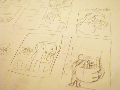
Step 3: Method of coloring illustrations, Executing illustrations
After sketches on paper, the process continued with trying different methods of digitally coloring the illustrations. One, was to use live paint on illustrator, two, was to manually do lineart in photoshop and paint using masks and the wand tool, three was manually creating lineart in illustrator and paint using fills.
The most time efficient and suitable look was a combination between live paint and manual lineart in illustrator, which was adopted into the book. The fullsize sketching of the illustrations were started.
Illustrations based off of storyboard sketches were executed. Pencil sketches were first completed.
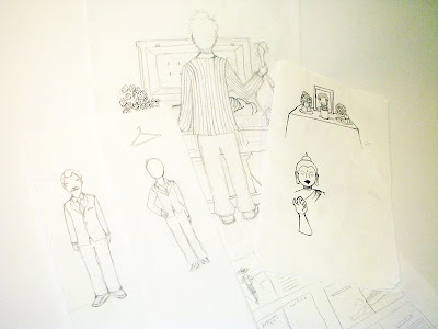
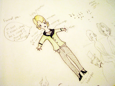
The cover and several mockups were done first to set a tone that was important for consistency while doing the rest of the layouts and illustrations.
Mockups


Step 2: Setting an Illustration Style, Storyboard and Layout Sketches
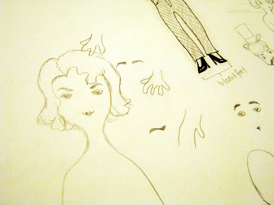
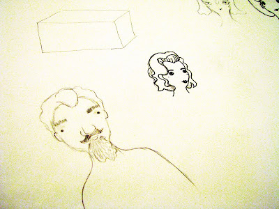
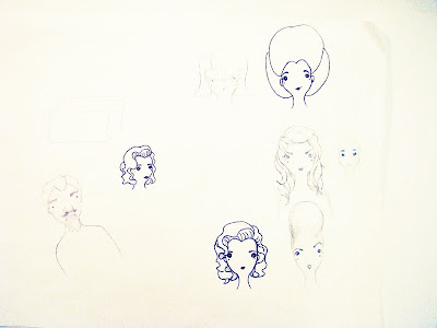
At this stage, illustration styles were explored by mix and matching different expressions and drawing elements from inspirational images. A standard (main) character was created and then tweaked by thickening eyebrows, changing the eyes, and facial shapes.
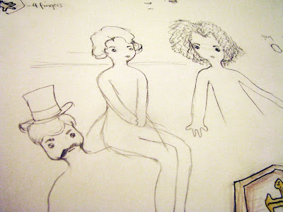
Storyboards were drawn up to sample potential ideas before they can be fully produced, which was crucial to the process, as full illustrations consume a lot of time. They were filtered afterwards and executed.
A variety of slightly tweaked faces:
A rought sketch of the final standard character:
More tweaking done:
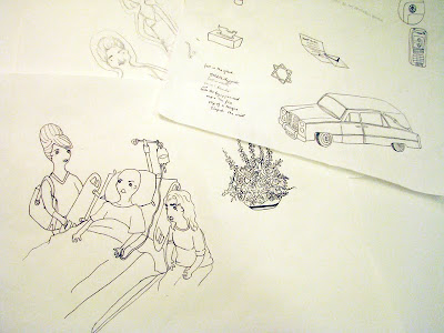
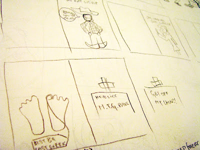
Storyboard sketches and potential spreads:
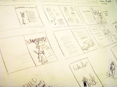
Brainstorming for potential illustration content:
Storyboards were drawn up to sample potential ideas before they can be fully produced, which was crucial to the process, as full illustrations consume a lot of time. They were filtered afterwards and executed.
A variety of slightly tweaked faces:


A rought sketch of the final standard character:

More tweaking done:


Brainstorming for potential illustration content:


Step 1: Researching Content/Inspiration, Writing Manuscript, Determining Dimensions
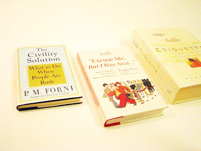
Throughout the process of research I encountered many books and online forums discussing the topics at hand.
Books I read on etiquette:
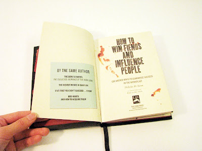
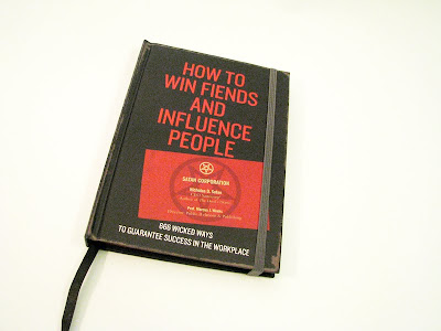
One book in particular was of great inspiration, although the only thing adopted from it was the size. It was called how to win fiends and influence people.
How to win fiends and influence people:
The size of my book (4.5"x6.5") was chosen through trial and error and petite dimensions seemed more appropriate because the book was meant to be an easily transported item to be read on public transit, travel, or as a bathroom read etc.
Trial and error of book size:

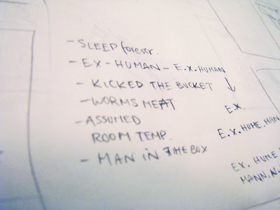
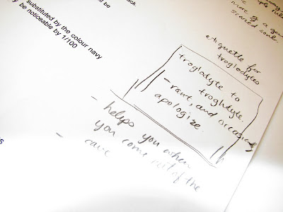
At the beginning of assembling the manuscript, the idea surrounding a troglodyte etiquette manual was explored. However, it did not work so well as more research was done, so it was kept only as an option. The sectioning of the content very clearly defined itself into death, disability and illness etiquette, which was used in table of contents of the book.
Ideas on troglodyte direction:
Books I read on etiquette:

One book in particular was of great inspiration, although the only thing adopted from it was the size. It was called how to win fiends and influence people.
How to win fiends and influence people:


The size of my book (4.5"x6.5") was chosen through trial and error and petite dimensions seemed more appropriate because the book was meant to be an easily transported item to be read on public transit, travel, or as a bathroom read etc.
Trial and error of book size:

At the beginning of assembling the manuscript, the idea surrounding a troglodyte etiquette manual was explored. However, it did not work so well as more research was done, so it was kept only as an option. The sectioning of the content very clearly defined itself into death, disability and illness etiquette, which was used in table of contents of the book.
Ideas on troglodyte direction:

Step 5: Production
The production of the book had to be coordinated with the printing company, time had to be allotted for them to print and bind the book. The actual file handed off to the printers had to formatted to an appropriate format so that they can print with ease. It was quite the learning experience. Especially when discussing available paper stock with the printers, there are an immense selection of resources just for paper.
Subscribe to:
Posts (Atom)
