This is a master post containing links to the 5 different steps of the Progress of book making, and the photos to document the final book. It is the submitted "short history of the project, your general thoughts about it's "whys and wherefores", and a characteristic selection of images of the inside and outside of the book." Enjoy!
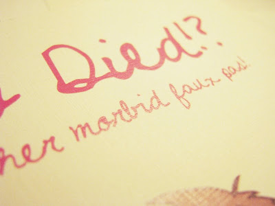
Sharing Book Photography of Who Died!?... and Other Morbid Faux Pas!
Step 1: Researching Content/Inspiration, Writing Manuscript, Determining Dimensions
Step 2: Setting an Illustration Style, Storyboard and Layout Sketches
Step 3: Method of coloring illustrations, Executing illustrations
Step 4: Choosing Paper and Binding Method
Step 5: Production
Sunday, December 13, 2009
Who Died!?... and Other Morbid Faux Pas!
Please click the images for a larger version!
Book front:


End paper:

Half Title:

Full title:


Table of Contents

Section title

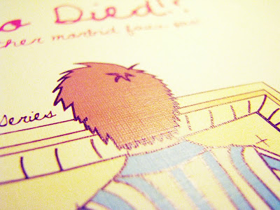
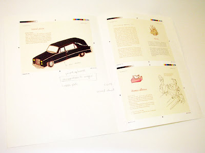
Spreads:


End of the book:


Step 4: Choosing Paper and Binding Method
After completing the cover and some mockup illustrations and layouts, choosing paper and a binding method (which was originally decided but changed as it did not feel appropriate) was the next step. Things such as texture, colour, warmth, and weight were looked at.
Possibilities in paper choice:
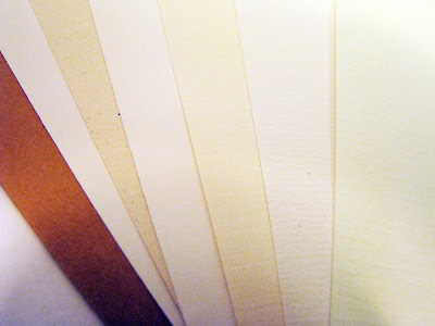
The final type of text block paper chosen was a slightly beige linen. It was picked because of the detailing that was not overly dominant, however gave the flat illustration coloring an added flavour. Initially, there was a concern over whether the texture was suited to the overall feel of the book, but in comparison to other papers, it felt appropriate.
Searching for the appropriate linen weight was a challenge as linen has a tendency to be comparatively more translucent at light weights (doublesided printing would show through), whereas another type of stock would not be as translucent. A compromise was made with a slightly heavier weight. There was also a difficulty in finding a matching cover paper, that was also linen, yet a heavier stock with the same colour. In the end, the paper used in the interior was doubled up to create the heavier cover.
A linen paper was chosen, note the detail in this image of a test print:
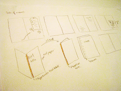
Several binding opportunities were explored as options. Intitally, the book was to be sewed in signatures (so it can lay open and flat) and cased in a hardcover, however, as the book progressed and developed its own tone of voice, a softer cover seemed more playful and thus, appropriate.
Also, perfect binding was chosen because the book is petite (4.5"x6.5") and did not need to lie flat (there was only one spread that had an image span across the full spread).
Sketching out self-binding methods and how to case in:
Possibilities in paper choice:

The final type of text block paper chosen was a slightly beige linen. It was picked because of the detailing that was not overly dominant, however gave the flat illustration coloring an added flavour. Initially, there was a concern over whether the texture was suited to the overall feel of the book, but in comparison to other papers, it felt appropriate.
Searching for the appropriate linen weight was a challenge as linen has a tendency to be comparatively more translucent at light weights (doublesided printing would show through), whereas another type of stock would not be as translucent. A compromise was made with a slightly heavier weight. There was also a difficulty in finding a matching cover paper, that was also linen, yet a heavier stock with the same colour. In the end, the paper used in the interior was doubled up to create the heavier cover.
A linen paper was chosen, note the detail in this image of a test print:


Several binding opportunities were explored as options. Intitally, the book was to be sewed in signatures (so it can lay open and flat) and cased in a hardcover, however, as the book progressed and developed its own tone of voice, a softer cover seemed more playful and thus, appropriate.
Also, perfect binding was chosen because the book is petite (4.5"x6.5") and did not need to lie flat (there was only one spread that had an image span across the full spread).
Sketching out self-binding methods and how to case in:

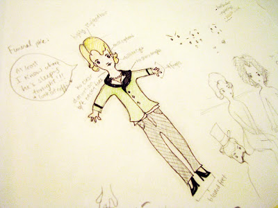
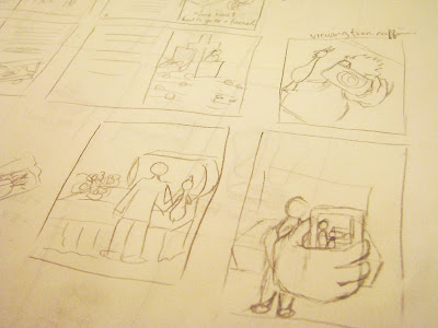
Step 3: Method of coloring illustrations, Executing illustrations
After sketches on paper, the process continued with trying different methods of digitally coloring the illustrations. One, was to use live paint on illustrator, two, was to manually do lineart in photoshop and paint using masks and the wand tool, three was manually creating lineart in illustrator and paint using fills.
The most time efficient and suitable look was a combination between live paint and manual lineart in illustrator, which was adopted into the book. The fullsize sketching of the illustrations were started.
Illustrations based off of storyboard sketches were executed. Pencil sketches were first completed.
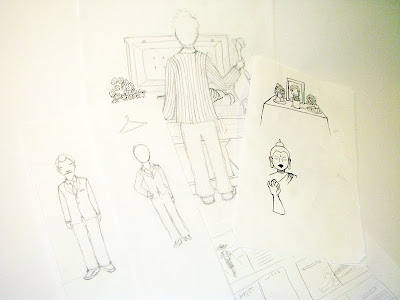
The cover and several mockups were done first to set a tone that was important for consistency while doing the rest of the layouts and illustrations.
Mockups

The most time efficient and suitable look was a combination between live paint and manual lineart in illustrator, which was adopted into the book. The fullsize sketching of the illustrations were started.
Illustrations based off of storyboard sketches were executed. Pencil sketches were first completed.


The cover and several mockups were done first to set a tone that was important for consistency while doing the rest of the layouts and illustrations.
Mockups


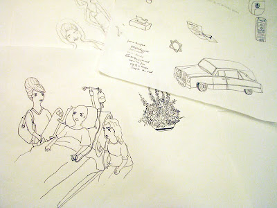
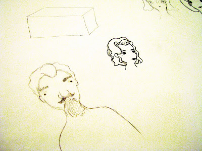
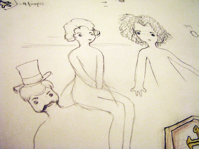
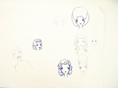
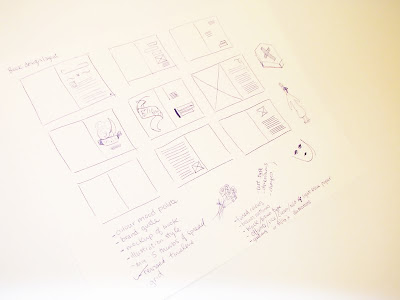
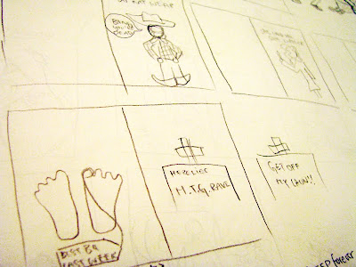
Step 2: Setting an Illustration Style, Storyboard and Layout Sketches
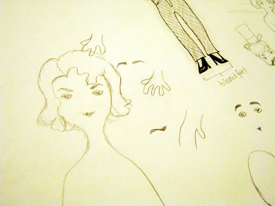
At this stage, illustration styles were explored by mix and matching different expressions and drawing elements from inspirational images. A standard (main) character was created and then tweaked by thickening eyebrows, changing the eyes, and facial shapes.
Storyboards were drawn up to sample potential ideas before they can be fully produced, which was crucial to the process, as full illustrations consume a lot of time. They were filtered afterwards and executed.
A variety of slightly tweaked faces:
A rought sketch of the final standard character:
More tweaking done:
Storyboard sketches and potential spreads:
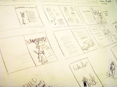
Brainstorming for potential illustration content:
Storyboards were drawn up to sample potential ideas before they can be fully produced, which was crucial to the process, as full illustrations consume a lot of time. They were filtered afterwards and executed.
A variety of slightly tweaked faces:


A rought sketch of the final standard character:

More tweaking done:


Brainstorming for potential illustration content:


Step 1: Researching Content/Inspiration, Writing Manuscript, Determining Dimensions
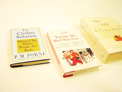
Throughout the process of research I encountered many books and online forums discussing the topics at hand.
Books I read on etiquette:
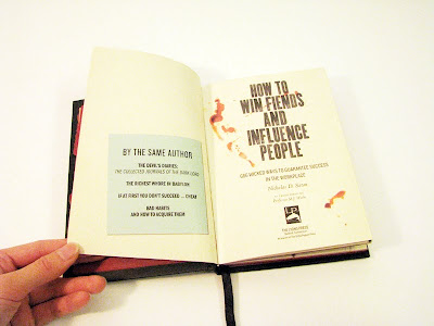
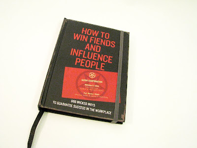
One book in particular was of great inspiration, although the only thing adopted from it was the size. It was called how to win fiends and influence people.
How to win fiends and influence people:
The size of my book (4.5"x6.5") was chosen through trial and error and petite dimensions seemed more appropriate because the book was meant to be an easily transported item to be read on public transit, travel, or as a bathroom read etc.
Trial and error of book size:

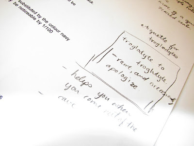
At the beginning of assembling the manuscript, the idea surrounding a troglodyte etiquette manual was explored. However, it did not work so well as more research was done, so it was kept only as an option. The sectioning of the content very clearly defined itself into death, disability and illness etiquette, which was used in table of contents of the book.
Ideas on troglodyte direction:
Books I read on etiquette:

One book in particular was of great inspiration, although the only thing adopted from it was the size. It was called how to win fiends and influence people.
How to win fiends and influence people:


The size of my book (4.5"x6.5") was chosen through trial and error and petite dimensions seemed more appropriate because the book was meant to be an easily transported item to be read on public transit, travel, or as a bathroom read etc.
Trial and error of book size:

At the beginning of assembling the manuscript, the idea surrounding a troglodyte etiquette manual was explored. However, it did not work so well as more research was done, so it was kept only as an option. The sectioning of the content very clearly defined itself into death, disability and illness etiquette, which was used in table of contents of the book.
Ideas on troglodyte direction:

Step 5: Production
The production of the book had to be coordinated with the printing company, time had to be allotted for them to print and bind the book. The actual file handed off to the printers had to formatted to an appropriate format so that they can print with ease. It was quite the learning experience. Especially when discussing available paper stock with the printers, there are an immense selection of resources just for paper.
Tuesday, November 24, 2009
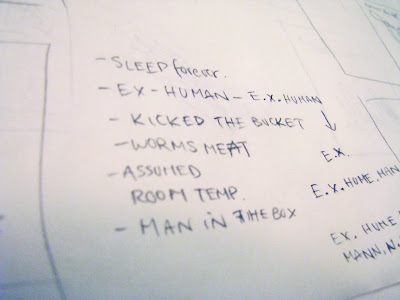
Final title?
Who died?... and other morbid faux pas!
I think that's it, unless something better comes up, that will be the title!
Goal: Finish for tomorrow as many thumbnails as possible for spreads.
Monday, November 23, 2009
Book title
Okay, so I'm letting go of the troglodyte idea completely (it just doesn't work anymore and there's no point in forcing it)
What about this title?
Who Died?... and other morbid questions
Who Died? (subtitle)
Funeral Faux Pas... and other sad things
Still working hard, at this point, I 'm getting panicked...
Saturday, November 21, 2009
progress
Tentatively typesetting my book at the moment. Contemplating of changing the size to be smaller, so it is easier to handle and transport as something entertaining to kill time (or a bathroom read). Probably 4.5 x 6.5 inches portrait;it will still be hardcover.
Still having lots of trouble coming up with a book title and cover art!
potential titles:
- Etiquette of the Uncomfortable
- Etiquette of the Unhappy
- Shit happens...
- Sad Times... a guidebook
- Good manners, sad times
- Good manners, Bad days
- Don't Clap at a funeral... and other tips
I am currently focusing on the book binding, typesetting, illustrations and overall design of the book. The writing of the book is turning out to be a lot less funnier than I want, (reading about funerals is a bit of a downer) but it will have to suffer due to time constraints. I can fix it up for the gradshow afterwards.
Goal is to test out hardcover sewing and binding technique by wednesday.
MUST WORK HARD! YOU CAN DO IT FRANCES!
Tuesday, November 17, 2009
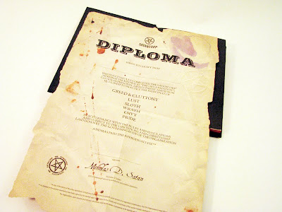
How to Win Fiends and Influence People
Today I saw a book called "How to Win Fiends and Influence People: 666 Wicked Ways to Guarantee Success in the Workplace" by Nicholas D. Satan.
I absolutely loved it! It had a lot of illustrations and fold-outs and looked like a notebook (moleskin) that was kept by someone that consistently made notes in it. It was eroded in the graphic look with lots of coffee and blood stains all over the pages. This book is very much the interactive type of book; there was a foldout of a diploma for after you finish reading it.
I really wish I could find some photos on it, I think I might go back to the book store and buy it.
QUESTION: is there a do it yourself method to stain the fore-edge of the book a certain colour or metallic?
Thursday, November 12, 2009
Preface (revised)
I'm starting to have some qualms about using the word troglodyte as one of the main terms in this book. I want the narrator to have a satirical quirky tone, but that doesn't help (or match) the idea of pulling out troglodytes from their reclusive nature. The narrator is a voice telling the reader how to handle situations with the assumption that the reader wants to know what's best, the narrator is not afraid of stepping on anyone's toes.
Perhaps the more accurate way to use troglodyte would be troglodytic tendencies, and people are only sometimes, ignorant and reclusive when it comes to dealing with things. Perhaps I will just forgo the word all together, if it does not match, although it would be an interesting addition to the mix.
My book is at a point in stage that things are really moving and changing while new ideas and solutions popup.
Direction:
When I first thought of this book, it was meant to be a charming, silly, yet informative book that is almost like a bathroom read. It has evolved to being that, and also having a voice that is somewhat of a slightly satirical tone that is meant to be taken in jest.
The illustrations depict a variety of unhappy scenarios of a main cartoon character (having nothing to do with the narrator), who is somewhat of an ignorant, naive character, most often making all the etiquette mistakes there are. Satire is used to poke fun at something, to send an underlying message, in this case, what NOT to do.
Audience:
Written from the view of a person who understands that even though etiquette and putting up a front sometimes seems fake and useless, it is a necessary as human interaction and is inevitable to avoid, therefore this book states how to use etiquette properly, within the subject matter of unhappy events.
This book intended for an audience that wants an understanding of how to deal with people that they are close, but not-so-close-with when stuck in unfortunate events. The audience might read the book for the satirical illustrations, the slightly mean narrating voice, or just to find out information on this topic.
Here is the preface of my book. Please read it and see if you can give me a suggestion for a title!
We live in a world of traditions, where facades and fronts are a frivolous necessity to representing our sincerity. This book takes that oxymoron to heart, its pages bearing information and instruction for pointless actions that play messenger to point-full meanings.
This book hopes to inform you individuals with troglodytic tendences, the way of the unhappy world, and how you should handle it. In the wake of situations that may leave most flabbergasted and too shocked and sorrow-stricken to react, you will know what to say and do to play your part as the close, but-not-that-close-friend. May you absorb its information at the speed similar to osmosis.
Tuesday, November 10, 2009
Three Questions
1. I'm facing a problem with my content. Right now, I am addressing the topic of funerals and patients with illness. I feel like I need a third or fourth topic. Any suggestions? I was thinking, maybe I could discuss the topic of dealing with divorced individuals as well, and maybe also dealing with families who have recently had miscarriages? Too morbid for a funny informative book?
2. I am looking for book binding places and paper places in Toronto. I feel like I've come to a limit looking at paper at the usual place I go to. I am looking for something heavy creamy very subtly textured feel for my book. Any suggestions?
3. How do you feel about setting copy text in colour? I'm debating if I should set it in a very subtle brown.
Wednesday, November 4, 2009
Experimental Binding Project: Old Master Q
Content:
For this project, I decided that I wanted to compile my favourite Master Q comic strips together. I grew up reading these comics in Hong Kong and even after I immigrated to Canada, I continued to search for Master Q issues.
Here is an excerpt regarding the comic's role in the political scene of China in the 60's - 80's.
"While Old Master Q comics primarily focuses on humor, it also reflects changing social trends, particularly from the 1960s to the 1980s. The comics would sometimes feature societal problems in urban life, such as poverty, petty thefts and secret societies. It also poked fun at fashion, contemporary art and rock music. The comic strips sometimes also bemoan the decline of ethical or moral values in modern day living. One can spot characters displaying acts of selfishness or misery, although the comics occasionally display good values like filial piety." - wikipedia
Form:
The most desirable form of a comic book is for it to lay flat when being read. The reason being, is that the illustrations are meant to be seen and admired, instead of peeked at in fear of damaging the spine of the book. Almost all Master Q issues are perfect bound in a flimsy manner, and after years of opening and re-opening these issues even with care, the pages have started to fall out.
Stemming from this idea, I chose to do a coptic bind, which allows the book to lay flat. I wanted a treasured, dated, classic look to represent the legend that Old Master Q comics carry in their existence, and to represent a golden piece of my childhood. Coptic binding was just the look I wanted to match the textured cover.
Here are some photos of the master Q book, previous to being cropped. I wish I had chosen a better backdrop for the book.


Funeral Jokes
A website of funeral jokes, inspiration for illustrations!
http://www.jokesaboutfunerals.com/
reminder to self: post 3 questions and answer 1 question of everyone else's!
Thursday, October 29, 2009
Revised Blueprint for Term Project
Essence statement
For the reader looking for a simple read that is not all words, this book aims to explain and propose etiquette that can be used when faced with situations that are usually uncomfortable, unhappy, and devastating in a relatively light-hearted manner. Three essence words that can be used to describe its intended mood: light, informative, and satirical (this word is applied to the illustrations).
I've changed one of the essence words from 'fun' to 'light', as I feel this boo
k would not be read for fun but for interest, nor would it be action-packed with fun, but it is a lighter take on death and tragic occurrences.
Current Book Status
Dimension: 6 x 8 inches
Number of pages: 64 - 96 pages (4 - 6 signatures of 8) depending on how much content there is to cover.
Prelims to be included: end-papers, half title, title page, table of contents, and acknowledgments/introduction
End matter to be included: (maybe) a bibliography, colophon, and end-papers
Cover: Hardcover
Binding: Sewn, covered spine
Paper stock: heavy, low-gloss, cream colored
Font choice:
Chapter Title:
ITC Tiffany demi italic 21 pt.
The title should be decorative, but not overly empowering to draw attention away from the illustrations.
Body Copy:
Life roman 9.5/13.5 pt.
To match the light-hearted mood that this book is trying to convey, the type chosen should not be overly solid or serious, nor should it be overly thin and light so that it lack legibility.
Running Head:
Trade Gothic medium 8.5 pt. (majuscule)
Running heads will communicate the chapter title, and will be removed on pages where a new chapter begins and there is a chapter title.
Folio:
Trade Gothic medium 9.25 pt.
Layout: refer to images


Colour Palate (refer to images):
The colors chosen are meant to represent red, cyan, green, brown respectively, seen under a faded, ephemeral outlook. The faded look is adopted mainly for artistic style, but also to fit the nature of these situations i.e. funerals, illnesses which are passing moments themselves. The brown color will be used mainly as outlines on the illustrations.
Illustrations:
Style, and colors decided. Illustrations not commenced.
Manuscript: Research complete. Not yet started the writing.
To do:
- Illustrations
- Manuscript
- decide paper stock weight
- decide if I want to bind the book or if I should take to a printer
Reflection of current pace
There is an overall feeling of falling behind, as the manuscript and illustrations are slow to start and designers block is frustratingly pervasive. I feel that I have a very solid understanding of the grid I am working with and the baseline settings for the body copy. I have a clear idea of the illustration style that I want to express, I am worried if this can be completed on time; it is A LOT to illustrate, but I want to do my best.
Revised Timeline.
The difference between this timeline and the previous one is that the dates have been pushed back to accommodate for unpredicted delay in the writing and illustration process, otherwise known as designer's block.
Week 7 Oct. 28, 2009
Due next week: draft of manuscript to edit
1. roughly compile final manuscript
2. Continue with illustrations
3. Decide on binding technique and materials to be used
Week 8 Nov. 4, 2009
Due next week: final manuscript
1. tentatively typeset to estimate space
2. Continue editing content and illustrations
Week 9 Nov. 11, 2009
Due next week: rough prototype of book for critique, final illustrations completed.
1. Print out spreads with final content and illustrations in place (illustrations can have placeholders)
2. Construct a mini prototype using proper materials, bind using chosen binding technique (for practice)
Week 10 Nov. 18, 2009
Due next week: final prototype of book
1. Print final layouts.
2. If under reasonable price, create a final prototype of the book (Create hardcover, or get printers to do it).
Week 11 Nov. 25, 2009
Due next week: term project due
1. Print final layouts, bind.
2. Put together rough work document (if necessary)
Week 12 Dec. 2, 2009
Term Project Due
Friday, October 23, 2009
Typeface
I was looking up typefaces today and came upon this one, which I think might work well as title dividers for my term project. It exemplifies the fun feeling I wish to go for, my only concern is, is it too much fun for the sombre topic I am addressing?
I guess this question can be answered once the manuscript has developed a style.

Wednesday, October 7, 2009
"The Best Used Bookstores in Toronto"
Speaking of used book stores from class today, here is a list of "The Best Used Bookstores in Toronto" compiled by blogto.com
The list begins with
1. BMV Books
2. Monkey's Paw
3. Recycled Book Shop
and so on!!!
Ideas
I just had a thought about my book,


I think using an animal mascot might be beneficial in creating consistency, and setting the mood of the book. I'm also thinking an illustration of the rubber chicken in a casket and other animals attending its funeral is a funny thought, I'm not sure what it means yet and it might not work out.
Blueprint
Current Book Status
I have decided the topic of my book, on etiquette of gloomy and uncomfortable events, such as funerals, illness etc.. The topic may still be narrowed down or expanded, but for now, this is the general focus area of the content. The manuscript has not been written yet, and excerpts from other books may be taken. The book will be illustrated by me and the illustration style is to be determined.
I have decided that physically, the book will have a hardcover and back; the type of binding has not yet been decided. The prelims that will be included are: end-papers, half title, title page, table of contents, and acknowledgments/introduction. The end matter that will be included are: (maybe) a bibliography, colophon, and end-papers.
Within the book content, there will be a title-page separating each section and many illustrations to make it more inviting to those who are overwhelmed by text.
Tentative Essence statement
For the reader not necessarily grieving, but interested in etiquette that can be used when faced with situations that are usually uncomfortable, unhappy, and devastating (i.e. facing people who lost a loved one, cancer patient). Three essence words that can be used to describe its intended mood: light, informative, and satirical (this word is applied to the illustrations).
A short blurb about satire on wikipedia:
"Although satire is usually meant to be funny, the purpose of satire is not primarily humour in itself so much as an attack on something of which the author strongly disapproves, using the weapon of wit."
On the fence/still researching about:
I am unsure about the layout style; will the pages be decorated with flourishes or will a minimalist approach be taken? The dimensions, binding style, colour scheme, illustration style, typefaces, layouts, and materials have all yet to be determined. What type of bookmarking mechanism can I incorporate, or should I leave this out? The reason I am considering bookmarks is because this book is not one that is expected to be read all in one sitting. Should I leave the spine naked or clothed? Should I choose a friendly cream colored paper, or crisp, modern white stock?
The binding aims to reflect the content and illustrations.
Plan of Attack
Week 5 Oct. 7, 2009
Due next week: rough manuscript
1. Plan out a table of contents to help organize what issues should be addressed within the topic of etiquette
2. Begin writing manuscript, sketching out rough illustration ideas that might be appropriate with content
3. Search up different hardcover treatments, and further binding techniques, consider how it would match the content of the book.
4. Explore typefaces and color schemes.
Week 6 Oct. 21, 2009
Due next week: final manuscript, and final blueprint (5%)
1. Continue editing and writing manuscript
2. Finalize illustration style, continue drawing for the book
3. Decide on style of binding, typeface, roughly the type of stalk and proposed color schemes; mood of the book
4. Create final blueprint for term project
Week 7 Oct. 28, 2009
1. Finalize manuscript
2. Continue with drawings
3. Search for further materials to be used
Week 8 Nov. 4, 2009
Due next week: rough prototype of book
1. Print layouts, even if not done (blank pages)
2. Create a rough prototype of the book, in small format, try out materials and binding methods
3. Continue editing content and illustrations
Week 9 Nov. 11, 2009
Due next week: rough prototype of book
1. Typeset spreads and place illustrations.
2. Print layouts, bind using chosen binding technique (for practice)
Week 10 Nov. 18, 2009
Due next week: final prototype of book
1. Print final layouts.
2. If under reasonable price, create a final prototype of the book (Create hardcover, or get printers to do it).
Week 11 Nov. 25, 2009
Due next week: term project due
1. Print final layouts, bind.
2. Put together rough work document (if necessary)
Week 12 Dec. 2, 2009
Term Project Due
Research/Inspiration Material
I am reading and drawing from several books on etiquette that I have borrowed, and also looking at various illustration styles to create one that is appropriate for this book.
Here is a list of books I am reading right now:
The Civility Solution - P.M. Forni
The Etiquette of Illness - Susan Halpern
21st-Century Etiquette - CHarlotte Ford
Emily Post's Etiquette - Peggy Post
Excuse Me, But I was Next - Peggy Post
A Fabulous Girl's Guide to Decorum - Kim Izzo and Ceri Marsh
Occasions - Kate Spade
Here are some illustrations I have saved for inspiration (credits to the respective owners):

matteobertell@deviantart.com


farfocle@deviantart.com

 Unknown artist
 Anna Rusakova
 Anna Rusakova
Anna Rusakova

Kate Wilson
Questions:
I feel as though a lot of the information I read is something I would have written it in my book anyways if I haven't read the extra material. How should I cite this type of information? Should I mention the authors?
Do we need to submit a process work document?
What are the recommended printing/binding stores that we can use?
Subscribe to:
Posts (Atom)
