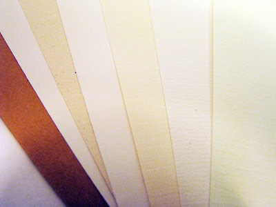
Possibilities in paper choice:

The final type of text block paper chosen was a slightly beige linen. It was picked because of the detailing that was not overly dominant, however gave the flat illustration coloring an added flavour. Initially, there was a concern over whether the texture was suited to the overall feel of the book, but in comparison to other papers, it felt appropriate.
Searching for the appropriate linen weight was a challenge as linen has a tendency to be comparatively more translucent at light weights (doublesided printing would show through), whereas another type of stock would not be as translucent. A compromise was made with a slightly heavier weight. There was also a difficulty in finding a matching cover paper, that was also linen, yet a heavier stock with the same colour. In the end, the paper used in the interior was doubled up to create the heavier cover.
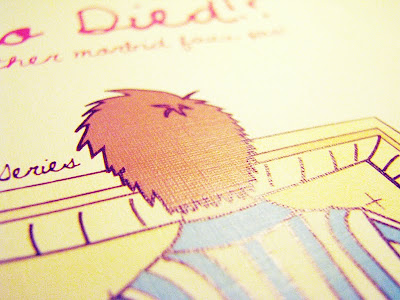
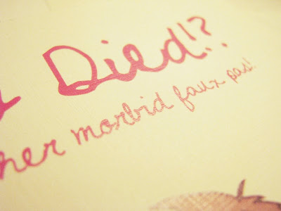
A linen paper was chosen, note the detail in this image of a test print:


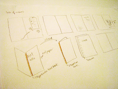
Several binding opportunities were explored as options. Intitally, the book was to be sewed in signatures (so it can lay open and flat) and cased in a hardcover, however, as the book progressed and developed its own tone of voice, a softer cover seemed more playful and thus, appropriate.
Also, perfect binding was chosen because the book is petite (4.5"x6.5") and did not need to lie flat (there was only one spread that had an image span across the full spread).
Sketching out self-binding methods and how to case in:


No comments:
Post a Comment